Order At Counter Sign
Download a free Order At Counter sign template in PDF and DOCX to guide customers to the right spot and keep your service line moving smoothly.
PDF
DOC
0
likes
Download Files
- DOC
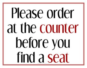
An Order At Counter sign is a simple display that tells customers exactly where to place their order, helping cafes, takeaways, and quick-service restaurants run a smooth, self-directed service flow. The most common reason businesses use one is to stop guests from waiting at tables expecting table service and instead direct them to the counter. You can download this template free in PDF and DOCX, with no signup required.
What Is an Order At Counter Sign?
An Order At Counter sign is a customer-facing notice — printed, framed, or mounted — that instructs people to walk up to the counter to order and pay rather than waiting to be served at their seat. It is typically created and displayed by restaurant owners, cafe managers, food truck operators, or front-of-house staff. The sign documents nothing legal; instead, it communicates the service model of the venue at a glance. By setting expectations the moment a guest walks in, it reduces confusion, shortens perceived wait times, and frees staff to focus on preparing and delivering food rather than chasing down orders.
When Do You Need an Order At Counter Sign?
This sign is useful any time your service model relies on customers ordering at a fixed point rather than from their table. Common situations include:
- Counter-service cafes and coffee shops where guests order, pay, and either wait or take a buzzer to their table.
- Quick-service and fast-casual restaurants that want a clearly marked ordering point near the entrance.
- Bakeries and delis with a display case where customers choose items and order at the same spot.
- Food trucks and market stalls that need a visible cue showing exactly where the line forms.
- Bars and taprooms that don’t offer table service and want patrons to order drinks at the bar.
- Pop-ups and seasonal venues where the layout is new to guests and signage prevents bottlenecks.
What an Order At Counter Sign Should Have
A good sign is read in under a second from across the room, so clarity beats decoration. The essentials are a short, unmistakable headline such as “Please Order At Counter” or “Order & Pay Here,” supported by a directional arrow or simple icon if the counter isn’t obvious. Add your business name or logo for brand consistency, and keep the typeface large, high-contrast, and easy to read at distance. If helpful, include a brief secondary line — for example, “Grab a number and we’ll bring it to your table” — so guests know what happens after they order. Leave generous white space so the message doesn’t compete with surrounding menus or decor.
How to Fill Out an Order At Counter Sign
This template is intentionally minimal so you can adapt it to your venue. Work through it like this:
- Choose your headline text. Replace the placeholder with your preferred wording — “Order At Counter,” “Please Order & Pay Here,” or similar — keeping it to a few words.
- Add a directional cue. If your counter isn’t immediately visible, insert an arrow or short phrase pointing the way (“Counter to your left”).
- Insert your business name or logo so the sign matches your other signage and branding.
- Add an optional secondary line explaining the next step, such as table delivery, a pager system, or a “name called” pickup.
- Set the font and colors for maximum contrast and legibility from across the room.
- Confirm the size and orientation to fit your frame, easel, or wall mount, then save as PDF for printing.
Because the template is editable in DOCX, you can tweak wording seasonally or swap the message entirely for a related sign without starting over.
Placement Tips for Maximum Effect
Where you put the sign matters as much as what it says. Position it at eye level near the entrance so guests see it before they choose a seat. A second, smaller copy at the counter itself reinforces the message for anyone who walks straight to the queue. Avoid hiding the sign behind plants, menu boards, or promotional posters that compete for attention. In larger spaces, consider a freestanding A-frame or tabletop tent so the message is visible from multiple angles. Good lighting helps too — a sign in a dim corner is easily missed during busy periods.
How It Differs From Related Signs
An Order At Counter sign is sometimes confused with a “Wait To Be Seated” sign, but the two communicate opposite service models. A “Wait To Be Seated” sign tells guests a host will seat them and table service follows, while an Order At Counter sign signals self-service ordering. Likewise, a “Pick Up Here” or “Collection Point” sign marks where finished orders are handed over — a separate step from placing the order. If your venue uses several of these, keep their wording and design consistent so the customer journey reads as one clear sequence rather than a set of mismatched notes.
Common Mistakes to Avoid
- Type that’s too small to read from the doorway, defeating the sign’s whole purpose.
- Low contrast colors — pale text on a busy background blends into the decor.
- Placing it out of sight, behind menu boards, displays, or at an awkward height.
- Overloading the sign with extra rules, prices, or paragraphs that slow reading.
- No directional cue when the counter location isn’t obvious to first-time guests.
- Inconsistent branding, so the sign looks like an afterthought rather than part of your venue.
Frequently Asked Questions
What is an Order At Counter sign used for? It directs customers to place and pay for their order at the counter rather than waiting for table service. This is essential for counter-service cafes, fast-casual restaurants, food trucks, and bars where staff don’t take orders at the table. The sign sets expectations instantly and keeps the service line moving.
How do I customize this template? Open the DOCX version and edit the headline text, add your business name or logo, and adjust the font and colors to match your branding. You can also add a directional arrow or a short line explaining what happens after ordering. Once finished, save it as a PDF for clean, consistent printing.
What should the sign say? Keep it short and direct — “Please Order At Counter,” “Order & Pay Here,” or “Order At The Bar” all work well. A brief second line, such as “We’ll bring it to your table,” can clarify the next step. Aim for wording a guest can absorb in a single glance.
Where should I place the sign? Position it at eye level near the entrance so customers see it before choosing a seat, and add a smaller copy at the counter itself. Make sure nothing blocks the line of sight and that the area is well lit. For open layouts, a freestanding A-frame or tabletop tent improves visibility.
Is this sign template really free? Yes. You can download the Order At Counter sign in both PDF and DOCX formats free of charge, with no signup or account required. Use it for a single location or customize copies for multiple venues at no cost.
What size should I print it? That depends on your space and viewing distance — a tabletop tent might be small, while an entrance sign should be large enough to read from several feet away. The template can be scaled to common frame and poster sizes before printing. Always do a quick test print and check legibility from a customer’s typical entry point.
This template is provided as a general example for informational purposes only and does not constitute legal, business, or professional advice. Signage requirements, accessibility standards, and local regulations vary by location — consult the appropriate authority or a qualified professional to ensure your signage meets applicable rules.
Related Forms
- Brunch Menu
- Bathrooms For Customers Sign
- Ingredient Usage Report
- Shift Change Form
- Line Starts Here Sign
- Half-Page Menu
Browse more in Restaurant.