Candidates Comparison Chart
Download a free Candidates Comparison Chart template to compare candidates side by side on issues, experience, and positions—free PDF and DOCX download.
PDF
DOC
0
likes
Download Files
- DOC
A Candidates Comparison Chart is a side-by-side worksheet that lets you evaluate two or more candidates against the same set of criteria—issues, experience, endorsements, and positions—so you can make an informed, organized decision. People most often use it to cut through campaign noise before an election and see how candidates actually stack up. You can download this template free in both PDF and DOCX formats, with no signup required.
What Is a Candidates Comparison Chart?
A Candidates Comparison Chart is a structured document that organizes information about multiple candidates into rows and columns for easy comparison. It is used by voters, civic groups, journalists, student organizations, hiring committees, and party volunteers to document where each candidate stands on key topics. Rather than relying on memory or scattered notes, the chart puts every candidate’s name, background, policy positions, and supporting details in one place. The goal is neutrality and clarity: by applying the same criteria to each candidate, the chart makes differences and similarities obvious. Whether used for a public office race or an internal board election, it turns a confusing field of choices into a clean, scannable reference.
When Do You Need a Candidates Comparison Chart?
This chart is useful any time you must choose between competing candidates and want to weigh them objectively. Common scenarios include:
- Preparing to vote in a local, state, or national election and wanting to compare positions on issues you care about.
- Running a voter education effort for a nonprofit, civic league, or community group that distributes nonpartisan candidate guides.
- School or campus elections where students evaluate candidates for student government or club leadership.
- Endorsement decisions by an organization, union, or association reviewing several candidates before backing one.
- Journalism and research, where a reporter or analyst documents candidate stances for an article or briefing.
- Board or committee selections, such as choosing among nominees for an HOA board, nonprofit director seat, or professional association office.
What a Candidates Comparison Chart Should Have
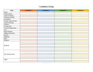
A strong comparison chart keeps the same criteria applied evenly to every candidate. At minimum it should include candidate names and the office or role being sought, plus a clear set of comparison categories down one axis—such as background and experience, major issue positions, endorsements, funding sources, and voting record where applicable. Each candidate gets a dedicated column so their answers line up across each row. Helpful additions include a header identifying the election or decision, the date the chart was prepared, the source of each piece of information, and a notes or rating section for your own assessment. Consistency is what makes the chart credible: every candidate must be measured against identical questions.
How to Fill Out a Candidates Comparison Chart
Because this template is a flexible grid, you customize it to your race. Follow these steps:
- Title the chart at the top—name the office, election, or decision (for example, “City Council District 4, November Election”) and the date prepared.
- List your candidates across the top of the grid, one per column, writing each candidate’s full name and party or affiliation if relevant.
- Define your comparison criteria down the left column. Choose categories that matter to your decision: experience, education, key issue positions, endorsements, campaign finance, and incumbency.
- Fill in each cell with concise, factual information for that candidate and that criterion, keeping wording parallel so columns are comparable.
- Cite your sources in a notes row or footer—official websites, voter guides, debates, or news coverage—so the chart stays verifiable.
- Add a personal assessment row at the bottom for your rating, ranking, or final notes once every cell is complete.
Tips for Keeping the Chart Fair and Accurate
The value of a comparison chart depends entirely on how evenly and honestly it is built. Ask every candidate the same questions and pull from the same types of sources for each—if you quote one candidate’s website, quote the others’ too. Use neutral, descriptive language rather than persuasive wording, and separate verifiable facts (such as years in office) from opinions (such as “strong leader”). When information is unavailable for a candidate, mark the cell as “no response” or “not stated” rather than guessing. If you plan to share the chart publicly, double-check every entry against an original source and date it, since positions and endorsements can change over the course of a campaign.
Comparison Chart vs. a Simple Candidate List
A plain candidate list tells you who is running; a comparison chart tells you how they differ. The chart’s grid format forces an apples-to-apples view, exposing gaps—like a candidate who has not stated a position on a major issue—that a narrative summary can hide. It also scales well: whether you are comparing two candidates or six, the structure stays the same, and adding a new criterion is as simple as adding a row. For organizations producing voter guides, the chart format is especially valuable because it signals fairness and lets readers reach their own conclusions instead of being told what to think.
Common Mistakes to Avoid
- Applying different criteria to different candidates—this breaks the comparison and introduces bias.
- Mixing facts with opinions in the same cells, making it hard to tell what is documented versus inferred.
- Leaving out sources, so readers cannot verify the information or judge its reliability.
- Using loaded or persuasive language that tilts the chart toward one candidate.
- Forgetting to date the chart, which matters because positions, polls, and endorsements shift during a campaign.
- Overcrowding cells with long paragraphs instead of short, scannable points that are easy to compare.
Frequently Asked Questions
What is a Candidates Comparison Chart used for? It is used to evaluate two or more candidates side by side against the same criteria, such as experience, issue positions, and endorsements. Voters, civic groups, journalists, and selection committees use it to make organized, informed decisions. The grid format makes differences between candidates easy to spot at a glance.
How do I fill out the chart? Title it with the office and date, list each candidate in a column across the top, and write your comparison criteria down the left side. Then fill in each cell with concise facts for that candidate and criterion, cite your sources, and add a final assessment row. Keeping the wording parallel across columns makes the comparison reliable.
Is this chart legally binding or official? No. A Candidates Comparison Chart is an informational and decision-making tool, not a legal or government document. It carries no official authority and does not affect ballots, registration, or election results—it simply helps you organize information.
How do I keep my chart unbiased? Apply identical criteria and source types to every candidate, use neutral and descriptive language, and clearly separate verifiable facts from personal opinions. Note when a candidate has not addressed an issue rather than filling in a guess. Citing sources and dating the chart further reinforces its fairness.
Can I use this for non-political elections? Yes. While it is ideal for public office races, the same structure works for student government, HOA and nonprofit board elections, union endorsements, and professional association votes. Any decision involving multiple candidates and shared criteria fits the format.
How much does this template cost? It is completely free to download here in both PDF and DOCX formats, with no signup or payment required. You can fill out the PDF directly or open the DOCX to add your own candidates, criteria, and branding.
This template is a general example provided for informational purposes only and does not constitute legal, electoral, or professional advice. Election rules and voter-guide requirements vary by jurisdiction and organization—consult the appropriate election authority or a qualified professional before relying on or distributing this material.
Related Forms
- Electorate Information
- Support Outreach Hours
- Fundraising Budget
- Voting Demographics By Age
- Voting Demographics By Education
- Voting Demographics By Income
Browse more in Political.